Sunday, July 26, 2020
Module 4: Crime Analysis
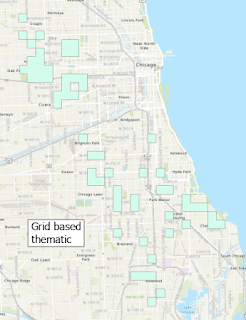
This week's lab had us conduct crime analyses and create hotspot maps using Grid Overlay, Kernel Density, and Local Moran's I methods of analysis. The resulting maps for each analysis method are depicted above.
A spatial join was used to combine the 2017 homicides layer with a grid layer for the city. This combined layer was then run through the Select by Attribute tool to select features with a homicide count greater than 0. These selected features were made into their own temporary layer, which was then exported to a permanent layer via the Feature Class to Feature Class tool. The 62 features with the most homicides were selected from the attribute table of this new permanent layer and were exported to their own temporary and then permanent layers in the same manner as mentioned above. A DISSOLVE field was added to this new top 20% layer and was populated with a value of 1 using the Field Calculator. The features were then dissolved to produce the output pictured in the Grid based thematic map above.
The Kernel Density tool was run on the 2017 homicides data and the symbology of the result layer changed to represent two classes, below and above three times the mean. The values in these classes were then reclassified to have a value of either 1 (less than 3*mean) or 2 (greater than 3*mean). The resulting raster was converted to polygons and the features with a value of 2 were selected and exported to a temporary and then permanent layer in the same process as described for Grid Overlay. The resulting output can be viewed in the Kernel Density map shown above.
A spatial join was utilized to combine the 2017 homicides and census tracts layers. A crime_rate field with a float data type was added to the attribute table of this combined layer. The field was populated with the number of homicides per 1,000 households using the Field Calculator. The Cluster and Outlier Analysis (Anselin Local Moran's I) tool was run and the features with a COType IDW 8990 value of HH were selected and exported to a temporary and permanent layer via the process described for Grid Overlay. The features in this new layer were dissolved to produce the output displayed in the Local Moran's I map found above.
The Select by Location tool was used to find how many 2018 homicides resided in the areas predicted by each method. The total area and number of 2018 homicide locations predicted correctly for each method increases from Grid Overlay to Local Moran's I, with the area of Local Moran's I being nearly twice that of Grid Overlay. However, the density of correctly predicted homicides increases from Local Moran's I to Grid Overlay. Kernel Density appears to be the most reliable method, as it correctly predicted a number of homicides close to Local Moran's I and has a crime density close to that of Grid Overlay.
Subscribe to:
Post Comments (Atom)


No comments:
Post a Comment