
Proportional symbols are an excellent and interesting method for mapping bivariate data; however, they can be rather difficult to implement effectively. This is due to the way ArcGIS handles the symbols, the negative values must be separated into their own layer and made positive. These dual layers cause potential issues with larger symbols in one layer obscuring smaller symbols of the other layer. In the map above (top), this issue was alleviated by changing the layers' positions in the drawing order and by adjusting the transparency of the symbols. Although this was a viable solution for the above map (top), this may not be the case for every dataset and caution should be exercised when attempting to utilize this symbology.
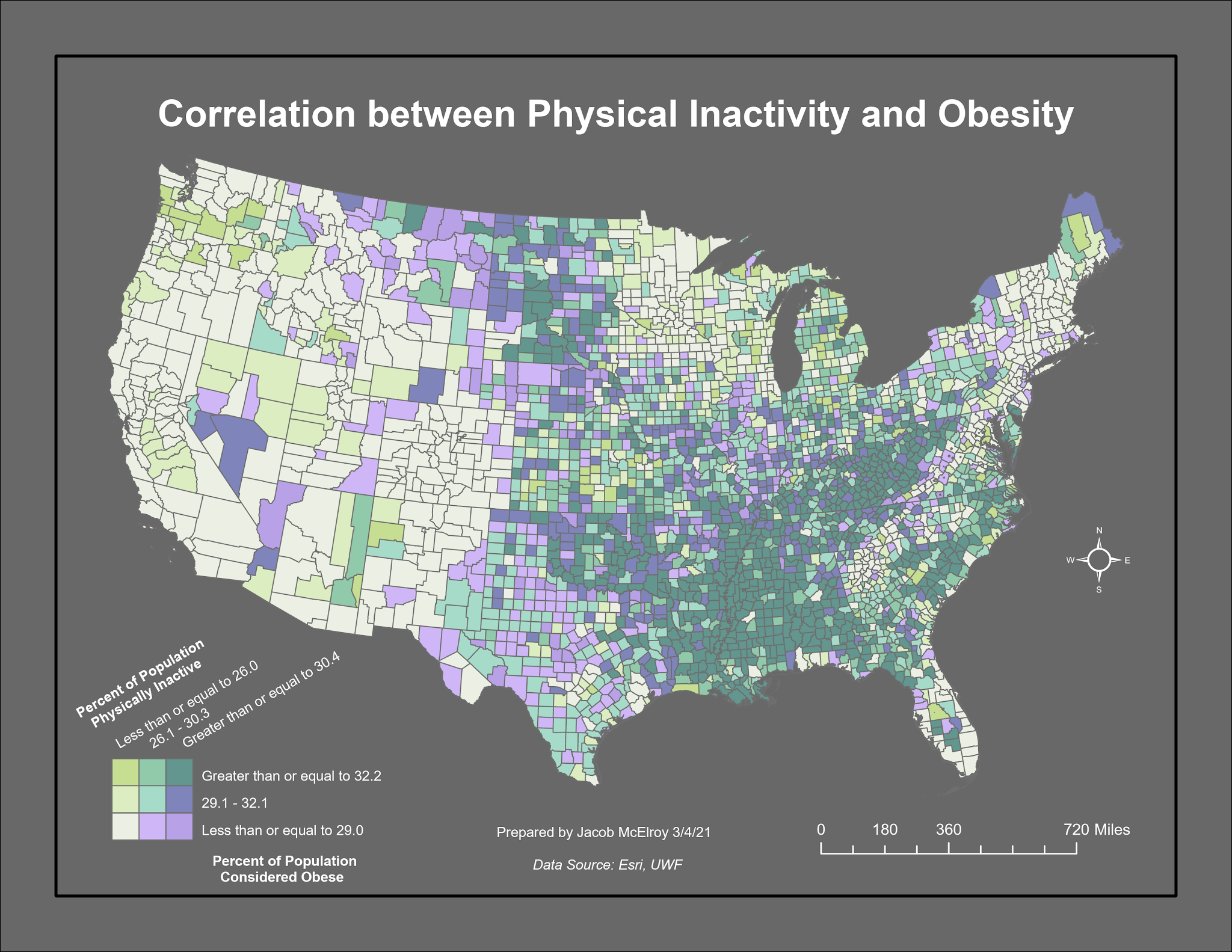
The process of mapping bivariate data via choropleth is more complex than that of proportional symbols. New text fields are created in the layer's attribute table, one for each variable and a third for the combined final product. The three-class qauntile symbology and histogram are used for each variable to find the breakpoints for each class. The features are selected according to which class they fall into for the first variable. The new field for this variable is populated using these selected classes, with each class being assigned a letter A-C. The same steps are taken for the second variable with the new field containing values of 1-3 rather than A-C. The final new field is populated by combining the new variable fields so that the values are combinations of A-C and 1-3. This combined field is then used in tandem with a unique values symbology to create a bivariate choropleth as shown above (bottom).
No comments:
Post a Comment